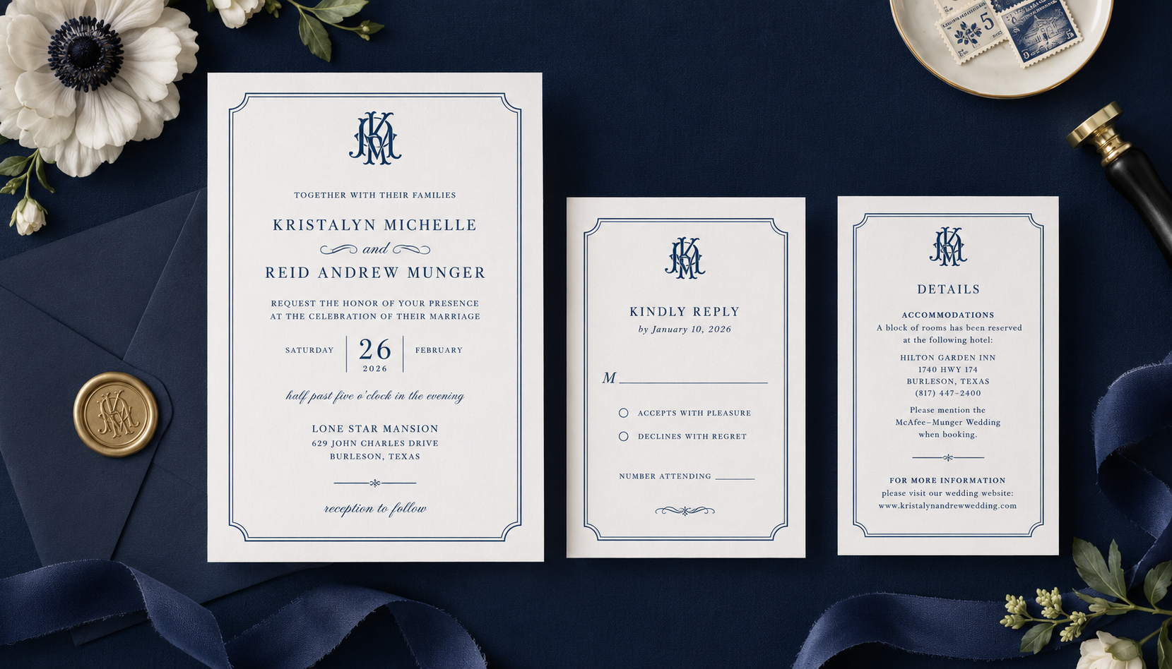
Navy blue can look simple, but achieving the right print version takes care. What appears deep and polished on screen can shift on paper, but with the right approach, you can get a navy that feels bold, refined, and true to your vision.
Here’s how to make it happen.
Start with the Right CMYK Build
A strong navy begins with the right formula. In digital printing, navy blue isn’t just “dark blue,” it’s a carefully balanced mix of inks.
To achieve a rich, accurate tone start here:
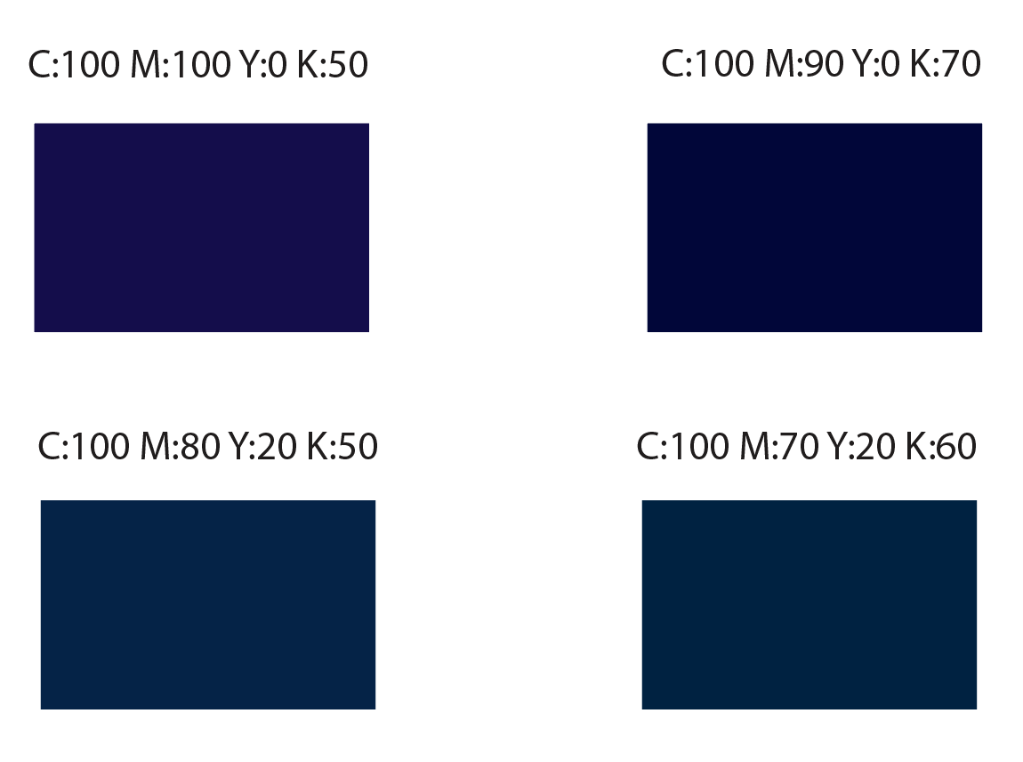
- Lean heavily on cyan (100%)
- Pair it with magenta (75%-100%)
- Keep yellow low (0%–20%)
- Add black (50%–70%) to deepen the color
Then adjust the values to receive the desired hue you want.
Keep Purple Tones Out of the Picture
One of the most common pitfalls with navy is ending up with a color that leans purple instead of blue. The fix is simple but important:
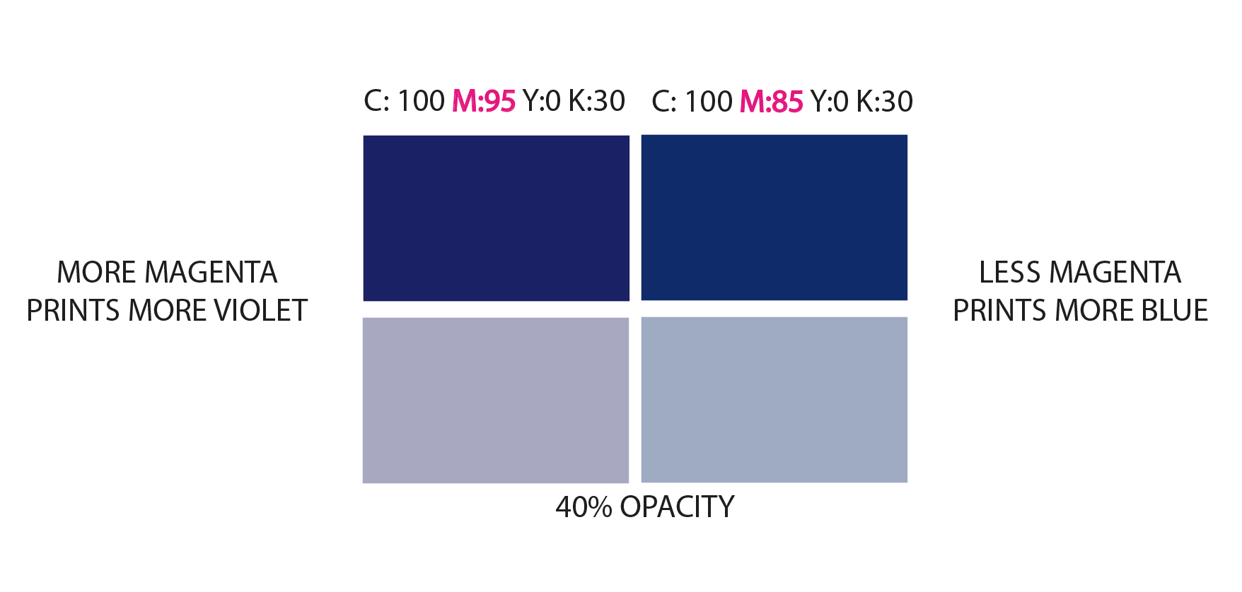
Make sure your cyan is at least 15% higher than your magenta.
This balance keeps the color firmly in the blue family and prevents that violet shift that can happen during printing.
A Helpful Opacity Check
Here’s a simple but powerful troubleshooting trick:
Decrease the opacity of a color swatch in your design program. Does it look lavender when viewed at 40% opacity? If yes, your mix may be leaning too purple.
In that case, decreasing the magenta can produce a color that will appear more blue and help bring the navy back into balance. This quick check is especially helpful when refining darker tones that feel slightly off on screen but become more obvious when layered or printed.
Always Design in CMYK (Not RGB)
If you’ve ever designed a beautiful navy on your screen, only to have it print completely differently, you’re not alone. The culprit is usually color mode.
RGB colors (used for screens) are naturally brighter and more vibrant. Unfortunately, they don’t translate directly to ink on paper.
To stay in control of your final result:
- Always convert your files to CMYK before printing
- Better yet, design in CMYK from the start
This ensures what you see is much closer to what you’ll get.
Print Swatches - Your Secret Weapon
Even with the perfect formula, paper type and printer variations can subtly shift your color. That’s why testing is key.
Create a range of navy variations, slightly adjusting black, cyan, or magenta, and order a test print on the paper you plan to use. Seeing these options side by side on your actual paper stock makes all the difference. To learn how to place a test order, please see our Placing A Sample or Proof Order article.
From there, you can confidently choose the navy that feels the richest and most accurate for your project.
Related Articles:
Was this article helpful?
That’s Great!
Thank you for your feedback
Sorry! We couldn't be helpful
Thank you for your feedback
Feedback sent
We appreciate your effort and will try to fix the article