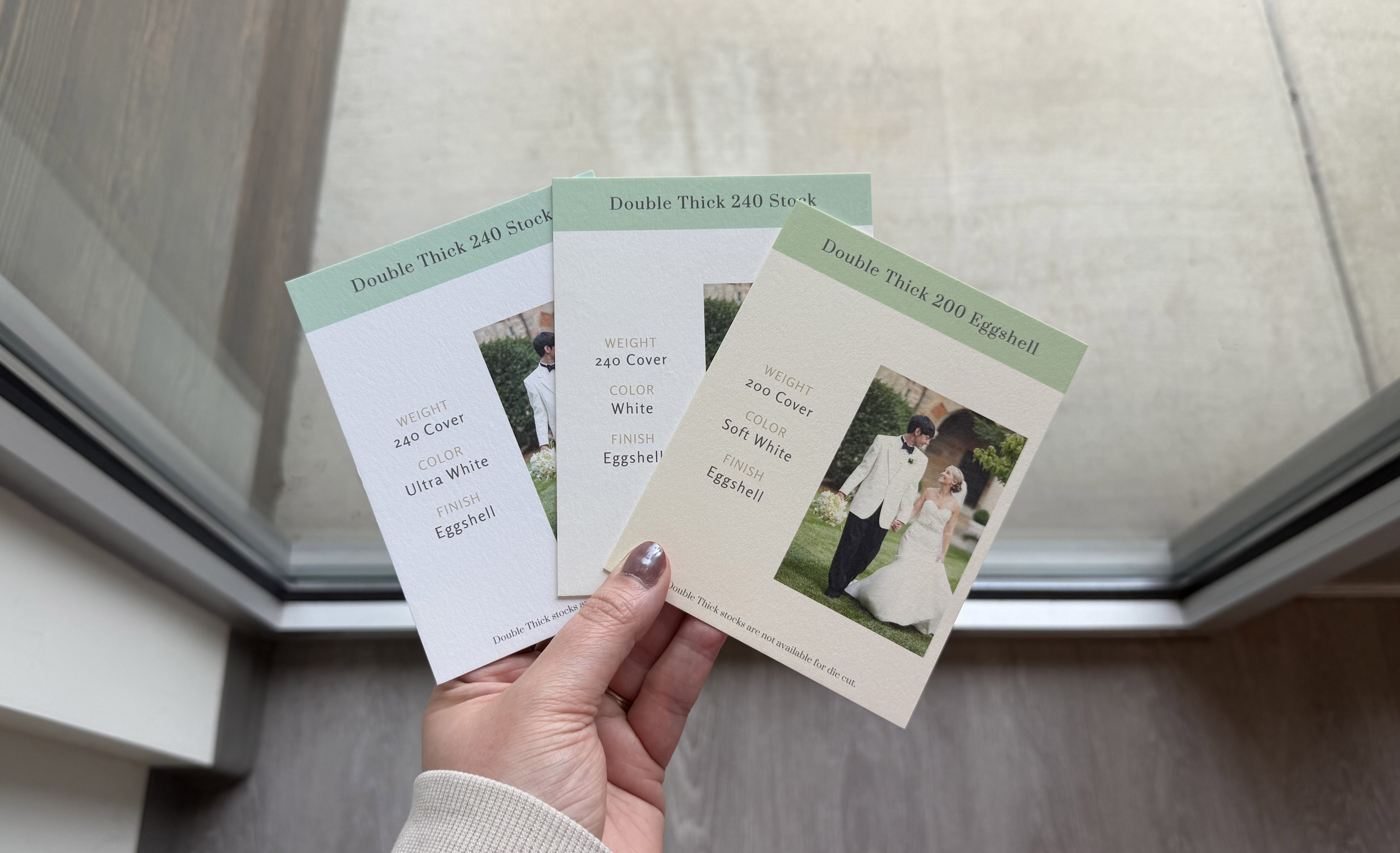
The paper type and paper color you choose can have a bigger impact on your printed colors than you might expect. Even when using the same design file, colors can look a little different depending on the paper type and shade.
Paper Type
Different paper types interact with ink in different ways.
For example, Cotton paper is more absorbent, so the printed color will appear a little softer and more subdued than it would look on a different paper type. Whereas other paper types like Eggshell or Felt hold the ink a little closer to the surface, which can make the colors appear sharper and more vibrant.
Because of this, the same design printed on two different paper types may not look identical.
Paper Color
Not all “white” papers are the same. Every stock color has its own undertone, ranging from warm (creamier, yellow-based whites) to cool (brighter, blue-based whites).
These undertones can impact how your printed colors are perceived. Warmer papers, like Soft White Eggshell, can make colors feel softer or slightly more yellow. Brighter whites, like Ultra White Eggshell, tend to keep ink colors looking cleaner and closer to what you see on your screen.
General Guidelines
- For full-color flood printing, we recommend using a cooler toned "white" paper stock, like our 110 Ultra White Smooth or our 120 Eggshell Ultra White.
- If you are creating a multi-piece suite and want consistent color across all items, we recommend using the same paper type throughout.
- When color accuracy is important to the project, placing a test or sample order is always a good idea.
Related Articles:
- How to Choose the Right Paper for Your Print Project
- What types of paper does PrintsWell offer?
- Color Tools & Palettes
Was this article helpful?
That’s Great!
Thank you for your feedback
Sorry! We couldn't be helpful
Thank you for your feedback
Feedback sent
We appreciate your effort and will try to fix the article