Fonts play an important role in both the appearance and readability of a printed design. While typography is often viewed as a stylistic choice, font selection also affects print clarity and text reliability in the finished product. Factors such as font style, size, weight, spacing, and color contrast all contribute to overall legibility.
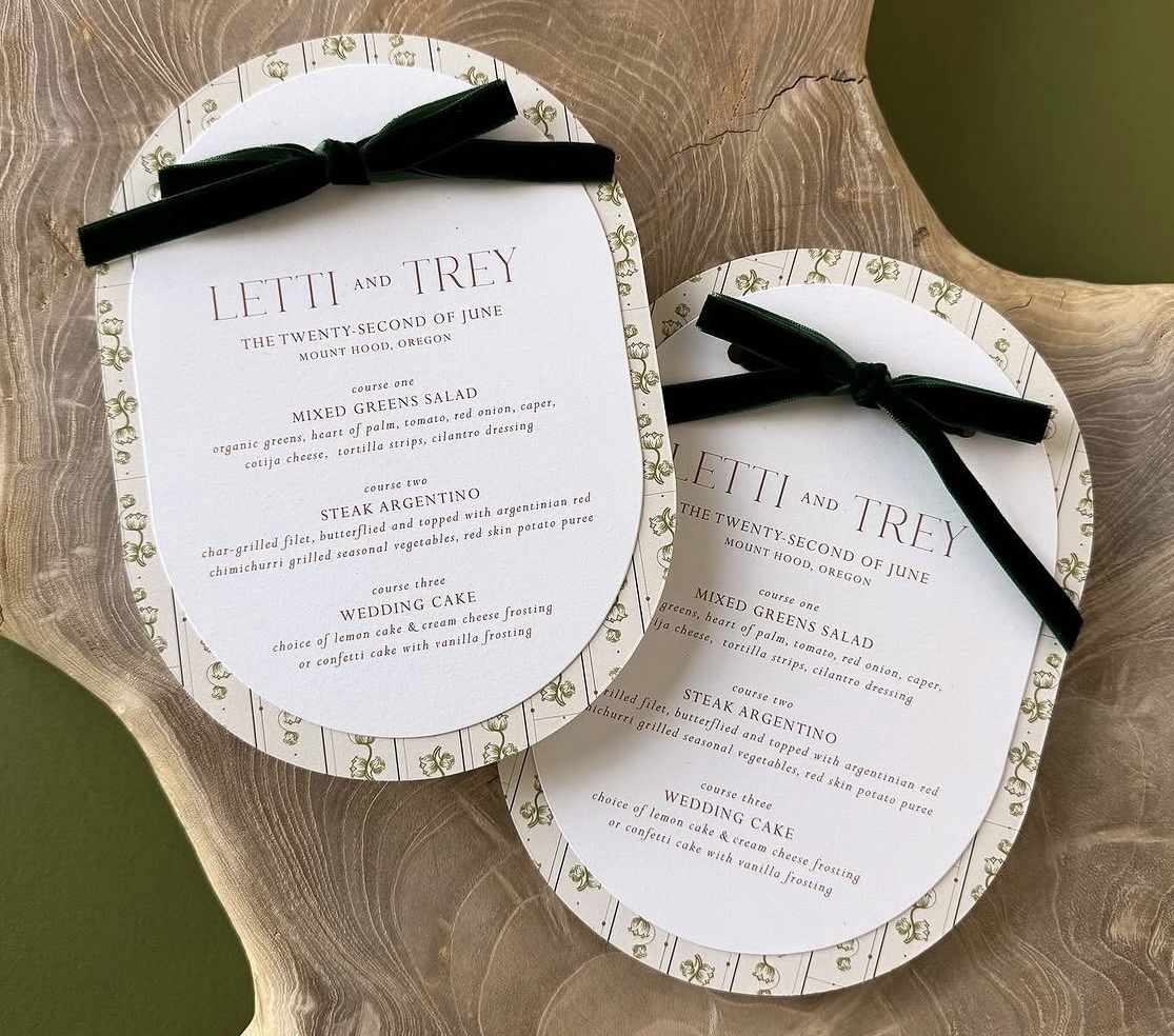
Readability and Font Sizing
Choosing an appropriate font size is essential for maintaining readability in print. A few tips to better evaluate readability:
- Keep in mind that different typefaces reproduce differently during printing.
- View your design at 100% scale to see how the text will appear at its actual printed size.
- When working with small text, print a physical proof at actual size before submitting your file.
Thin Fonts and Stroke Weight
Very thin or hairline fonts can be more difficult to reproduce consistently in print and may appear weak, broken, or faded in the finished product. Here are some things to keep in mind:
- Ultra-light font weights are especially risky at smaller sizes.
- When designing with small text, choose a slightly heavier font weight.
- For envelope printing, we recommend adding a minimum 0.25 pt stroke to thin fonts.
Spacing and Text Layout
Text that is too tight or crowded can become more difficult to read once printed. Giving text enough room to breathe through thoughtful spacing choices helps improve readability and creates a cleaner, more polished final result.
- Space letters properly when using all capital letters. Characters placed too closely together can reduce overall legibility.
- Line spacing should also be considered. Text that is stacked too tightly can appear dense and unclear.
Contrast and Clean Backgrounds
Poor contrast can make text difficult to read, even when the font itself is otherwise suitable for print. To improve readability:
- Use high-contrast color combinations between the text and background whenever possible.
- Avoid placing text over busy artwork, patterns, or textured backgrounds.
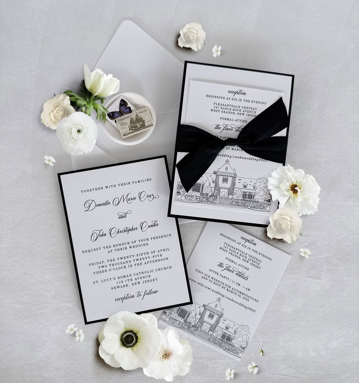
Decorative Fonts and Scripts
Script, decorative, and highly detailed fonts can be more difficult to read in print, especially at smaller sizes or in longer blocks of text. For key information such as dates and addresses, readability should always take priority to ensure important information remains clear and easy to read.
- Scripts and decorative fonts work best for names, monograms, or short headings.
- They are not as reliable for important details or extended copy.
Hierarchy
Important information should stand out through thoughtful use of size, weight, spacing, or contrast. This helps make key details easier to notice. Some things to keep in mind:
- Not every text element should compete equally for attention.
- Too much visual competition can make a design feel cluttered and difficult to follow.
- Clear typographic hierarchy helps guide the reader’s eye through the design in the intended order.
Key Takeaways
- Choose fonts and typography settings that prioritize readability, not just appearance.
- Use hierarchy, spacing, and contrast thoughtfully to help guide the reader through the design.
- Exercise extra caution with thin fonts, very small text, decorative typefaces, and busy or low-contrast backgrounds.
- Export files correctly and ensure fonts are properly embedded, outlined, or flattened so they print reliably and reproduce as intended.
Related Articles:
Was this article helpful?
That’s Great!
Thank you for your feedback
Sorry! We couldn't be helpful
Thank you for your feedback
Feedback sent
We appreciate your effort and will try to fix the article