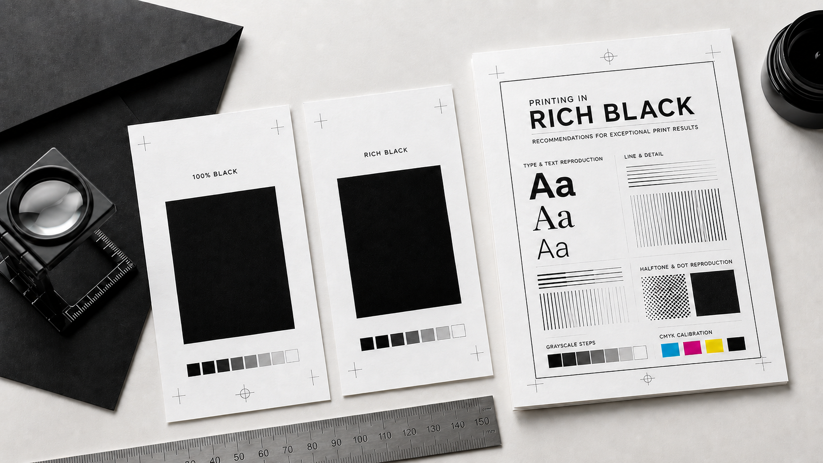
When it comes to achieving a deep, true black in digital printing, rich black is the way to go. Unlike the standard 100% black, which can often appear flat or dull, rich black combines multiple ink colors to create a more rich and dynamic black. This article will explain what rich black is, why we recommend using it, and how to set it up correctly in your design software to ensure optimal results.
What Is Rich Black?
Not all blacks are created equal.
In digital files, 100% black or true black (C:0, M:0, Y:0, K:100) might look perfectly dark on screen. But when printed, it often falls a bit flat, appearing more like a charcoal gray than a true black. That’s because it relies on just one ink: black.
Rich black takes things a step further by blending black with measured amounts of cyan, magenta, and yellow. This layered mix builds depth and density, giving the color a richer, more refined presence on the page. Instead of appearing flat or lightly printed, rich black feels smooth, full, and intentional, creating a finish that’s noticeably more polished and professional.
Our Recommended Color Build
To create a strong, balanced rich black, we recommend: C:60, M:40, Y:40, K:100
This formula adds just enough color to deepen the black without overpowering it or causing printing issues.
Why this works:
- The added cyan, magenta, and yellow enhance richness and coverage
- The black (K:100) keeps it grounded and neutral
- The total ink coverage is 240%, which is important.
Most digital presses have a total ink limit (often around 240–260%). Going beyond that can lead to problems like smudging, longer drying times, or muddy results. This build stays safely within that range, giving you a deep black that prints cleanly and consistently.
Check Your Software Settings
In both Adobe InDesign and Adobe Illustrator, there’s a setting called “Appearance of Black.” It controls how black is displayed and exported.
Even with the perfect color build, your software settings can change how black appears, especially on screen versus in print.
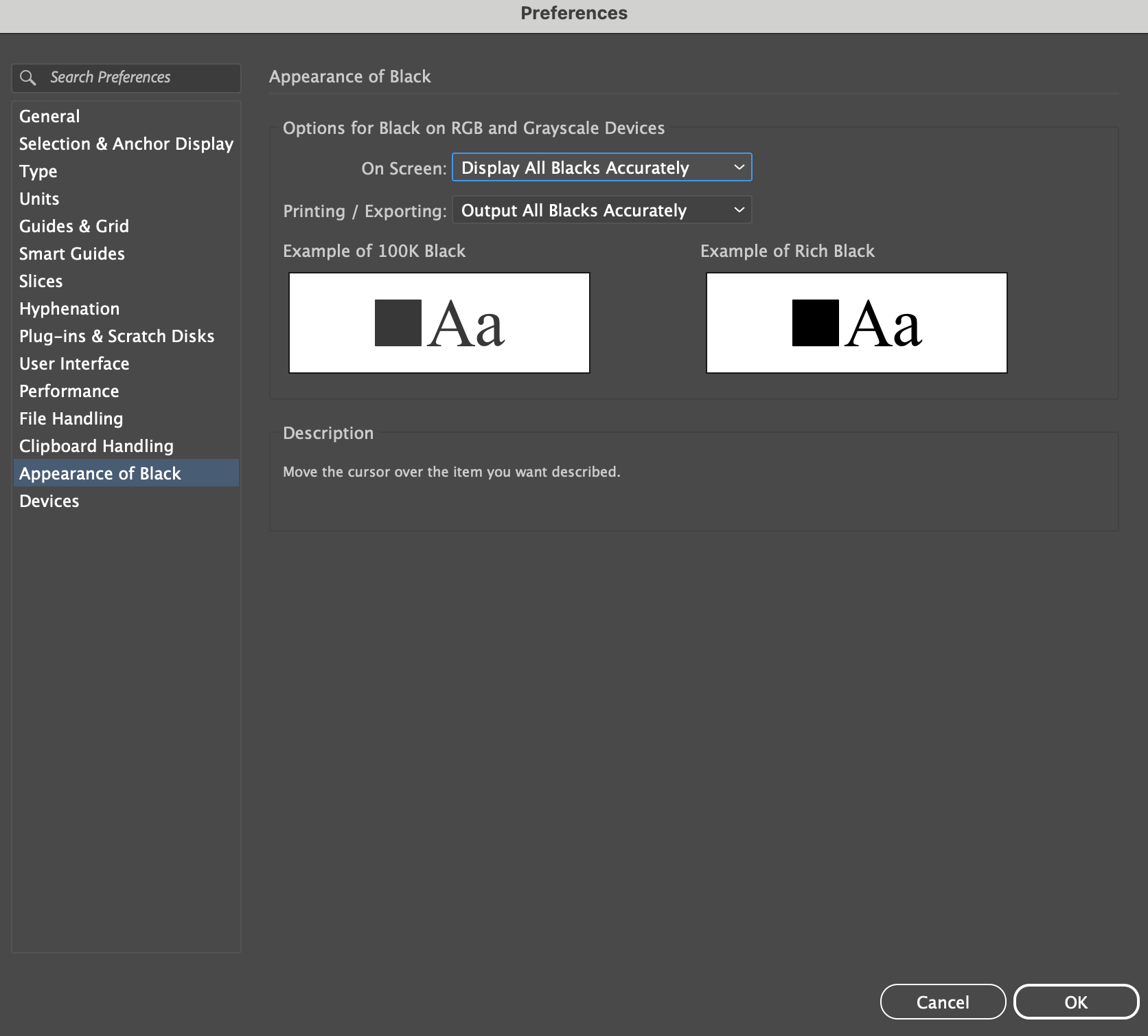
Adobe Illustrator: How to Check Appearance of Black
In Illustrator, the Appearance of Black settings control how black is displayed and exported.
To Locate the Setting:
1. Open Adobe Illustrator
2. In the top menu, select:
- Illustrator → Settings (Mac)
- Edit → Preferences (Windows)
3. Choose Appearance of Black
Recommended Settings:
Under the Printing/Exporting section:
- Set: Output All Blacks Accurately
This ensures that:
- 100K black stays true 100K black
- Rich black values remain exactly as you built them
- Your exported PDFs preserve intended color builds
For On Screen display:
- You may choose: Display All Blacks Accurately
This gives you a more realistic preview of how your blacks will actually print.
Adobe InDesign: How to Check Appearance of Black
InDesign includes similar settings, and they’re just as important when preparing print-ready files.
To Locate the Setting:
1. Open Adobe InDesign
2. In the top menu, select:
- InDesign → Settings (Mac)
- Edit → Preferences (Windows)
3. Choose Appearance of Black
Recommended Settings:
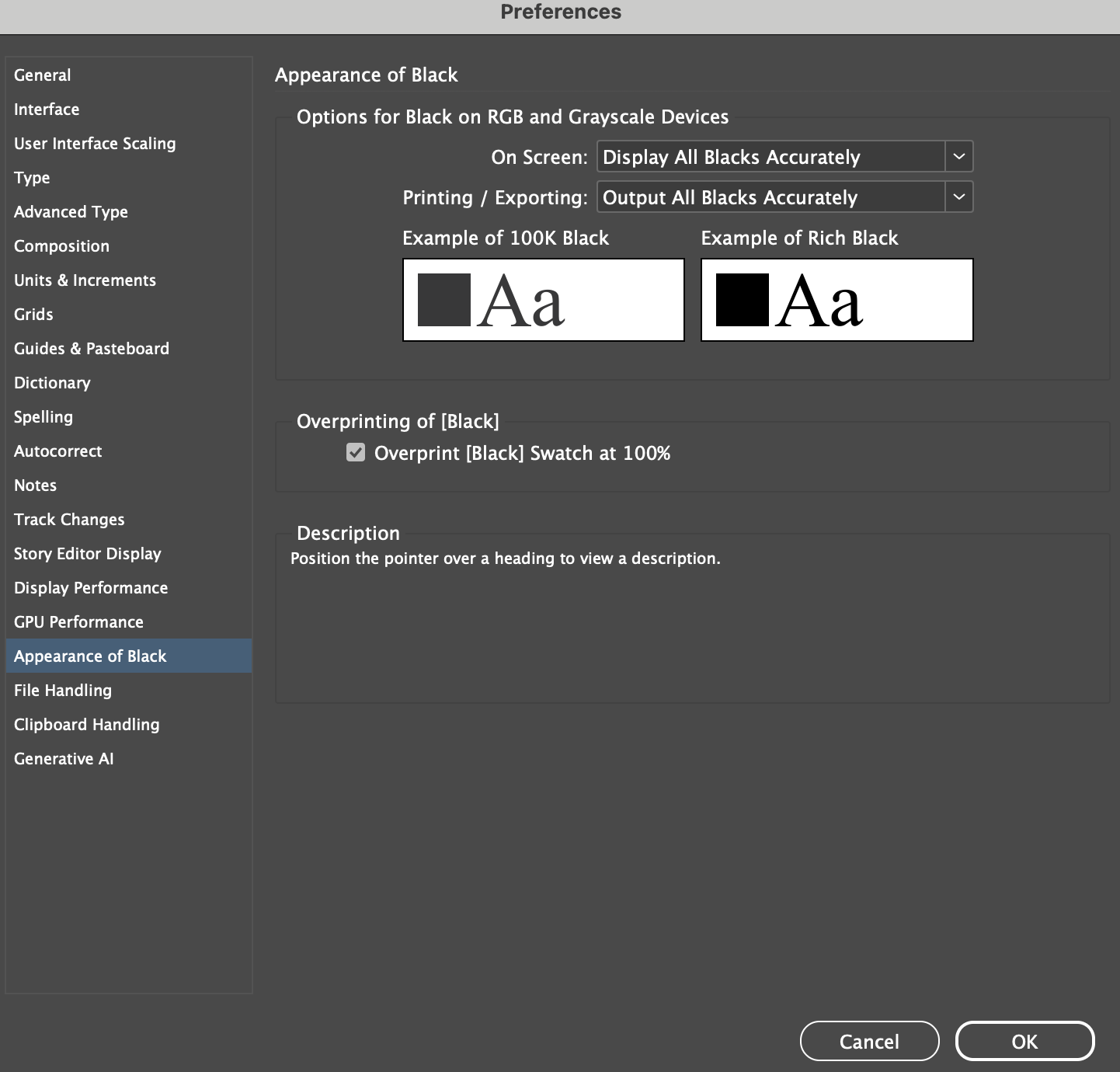
Under Printing/Exporting:
- Select: Output All Blacks Accurately
This helps preserve the integrity of your black builds during export and printing.
For On Screen viewing:
- Select: Display All Blacks Accurately
These settings help prevent Adobe from previewing all blacks as rich black automatically, giving you a more accurate representation of how your file will print.
Understanding “Overprint [Black] Swatch at 100%”
While you’re in InDesign’s Appearance of Black settings, you may also notice a checkbox called:
“Overprint [Black] Swatch at 100%”
This setting is small, but incredibly important.
When enabled, any object using the default [Black] swatch at 100% will automatically overprint instead of knocking out the colors beneath it.

What Does Overprint Mean?
Overprint is a print setting that allows one ink to print directly on top of another instead of knocking out the color beneath it. It’s commonly used with 100% black text and fine lines to help prevent registration issues and unwanted white gaps during printing.
When used intentionally, overprint can create cleaner, sharper results. However, applying it incorrectly, especially on large graphics or colored elements, can cause unexpected color shifts or transparency effects in print. That’s why it’s important to preview overprint settings carefully when preparing digital files for professional printing.
To learn more about what overprint is, when to use it, and how it works in print design, explore our “What Is Overprint?” article.
Designing Black for Print Success
A rich, true black doesn’t happen by accident, it’s built thoughtfully from the very beginning.
By understanding the difference between 100K black and rich black, staying within safe ink limits, and checking your software settings carefully, you will create print pieces that feel clean, intentional, and elevated.
Related Articles:
Was this article helpful?
That’s Great!
Thank you for your feedback
Sorry! We couldn't be helpful
Thank you for your feedback
Feedback sent
We appreciate your effort and will try to fix the article